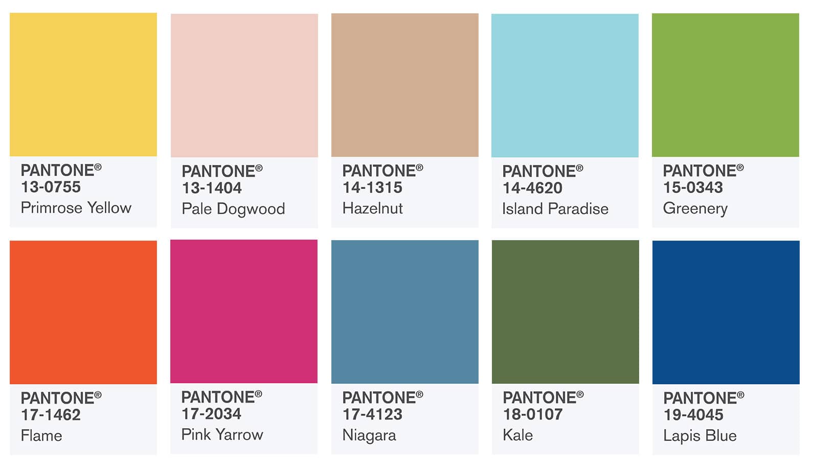
The kings of colour have been at it again, releasing their latest report on the colours set to adorn our clothes and our homes in the season to come.
Each season, Pantone work with New York Fashion Week to produce a palette of the top hues that appear in the fashion shows for the season ahead, which help to set a mood for the coming months and inevitably filter down into all elements of design. From the catwalks to our kitchens, these colours are sure to be surrounding us before long.
And, for Spring 2017, the colours are an absolute treat. Said to be a ‘mixture of vitality, relaxation and the great outdoors’, the 10 shades do a fabulous job of blending the light but bright colours we expect to see in Spring with a few really bold and rich choices, adding depth to the whole selection.
Muted earthy tones are key here, with the dusky green of Kale and the almost grey blush of Hazelnut being the absolute stars of the show in our opinion – but the pops of sunshine from Primrose Yellow, floral hues from Pink Yarrow and the sunset style of Flame really make this a diverse yet perfectly coalescing collection. In fact, the whole set of shades is really reminiscent of colours that surround us in nature, something that always comes to mind when you think of Spring – the leaves start to turn green, petals start poking their heads from the soil, and we start to see a little bit more sunshine.
According to Leatrice Eiseman, Executive Director of the Pantone Colour Institute, “One of the things that we saw this year, was a renewed sense of imagination in which colour was appearing in context that was different to the traditional”, and that during the fashion week which inspired this report, “designers applied colour in playful, yet thoughtful and precise combinations to fully capture the promises, hope and transformation that we yearn for each Spring”.
We’re delighted to see a colour palette for Spring that thinks about more than just the traditional pastels, and there’s lots of ways you can incorporate these hues into your branding and products for the coming season that will make sure you stay bang on trend.
These colours will be a key reference point for those designing new clothing or accessory collections for Spring, and the home is a key place where we see these come to life. Painted on walls, upholstered on sofas or used in soft furnishings, customers are sure to be incorporating these colours into their homes in 2017.
And another great way to bring these colours into your branding for 2017? Printed bags, of course! If you like the look of these shades but don’t want to bend your brand too far to fit them, then developing a range of bespoke printed carrier bags for the Spring which include these colours is a really fab way to stay chic and show you know your stuff when it comes to what’s in style, without having to change too much.
If you would like some quotes for your next stash of printed carrier bags, get in touch! Call us on 0191 268 7555 or email sales@theprintedbagshop.co.uk today!

