New Year is the perfect time to inject a little freshness into your brand and your bag designs, and experimenting with colour is a super easy way to do that. At The Printed Bag Shop, we love keeping an eye on which colours and trends are making an impact in the design world, and the Pantone Colour of the Year is a fantastic indication to follow.
What is Pantone?
Pantone is a standardised colour system which is used across the world, and is a way for artists and designers to ensure their work is produced in the colour it was meant to be – after all, colour is subjective, and it’s vital we have a way to classify it. Using a Pantone colour guide – you can see ours here – helps you identify the colour you’re after, communicate it clearly to people like us, and make sure that the colour is reproduced accurately in the printing process.
What makes a Colour of the Year?
For Pantone, it’s about so much more than a pretty colour. As well as taking into account design trends and colours that are becoming more commonly used, Pantone think about what’s going on in the world, what big issues we’re facing, the general mood of the public and assigns a colour they believe expresses all of that.
Last year, we told you about how Marsala, a rich deep red, was crowned Colour of Year – but this year’s choice is very different…
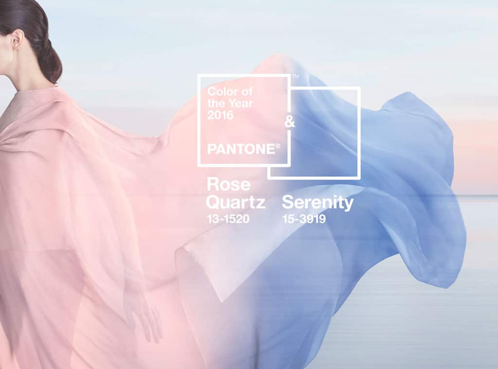
Pantone Colours of the Year 2016: Rose Quartz & Serenity
For the first time in Pantone’s history, the blending of two shades have been chosen as the Colours of the Year.
Going for ‘a softer take on colour for 2016’, Pantone have selected the warm pinkish tone Rose Quartz, the cooler, tranquil blue of Serenity, and the way in which these colours balance and blend with each other.
These subtle pastel shades were chosen to promote mindfulness, calm, peace and wellness to provide an antidote to the stressful lives we lead.
Rose Quartz and Serenity were also chosen to represent opposite ends of the traditional gender spectrum (through the use of pink and blue) and how the two are merging and blurring. 2015 was a year of huge debate around the areas of gender equality and fluidity, and 2016 is expected to progress these areas even further. Seeing a softer version of the stereotypical pink and blue merge in a soft purple is a way for Pantone to show this new approach to gender fluidity and expression.
How can we use these colours?
Pantone believes that whatever materials these colours are used for, they bring a sense of calm and relaxation. They look appealing in all kinds of finishes, from matte to metallic to glossy, and work well with a palette of mid-tone greens, purples and browns – with the addition of silver to add a bit more sparkle.
Of course, we’re not suggesting that you should rebrand all of your current artwork to include these new star colours! These are simply named as a guide, a source of inspiration and a way to express the mood of the year ahead. You could consider whether the colours work with your brand’s colour palette, and how you can incorporate them; or, you could think about the meaning behind them, about the blending of two shades to create flow and uniqueness, and think about how you can express this with your designs.
At The Printed Bag Shop, we can offer full bespoke consultation with regards to your bag design to help you create something fresh, modern and new for 2016.
To find out more about Pantone, how it works and how you can use it to make an impact on your printed carrier bags, simply call our lovely sales team on 0191 268 7555, or email sales@theprintedbagshop.co.uk.
To learn more about Pantone and the new Colours of the Year, check out their website.
(Image from Pantone)


