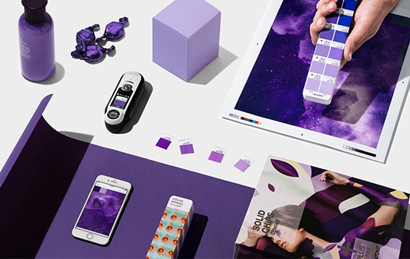
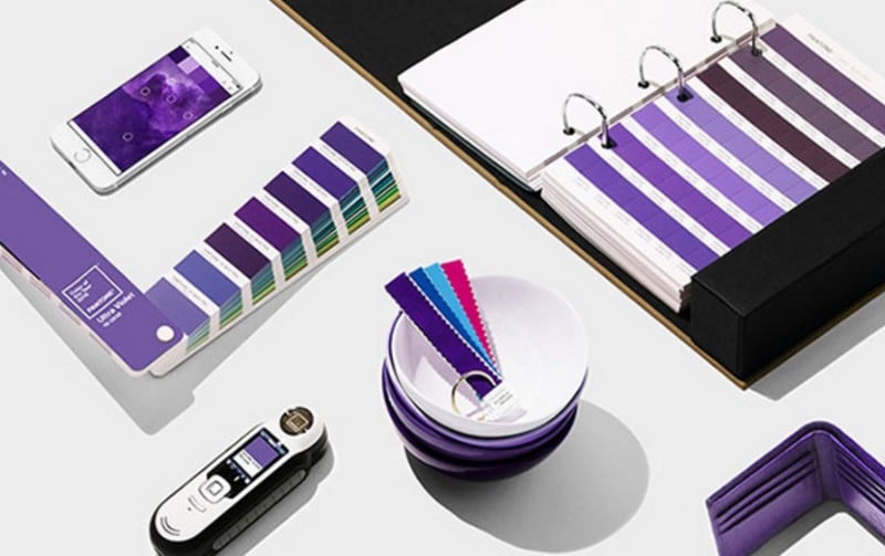
It’s here; the Pantone Colour of the Year that will influence design, print and fashion for 2018.
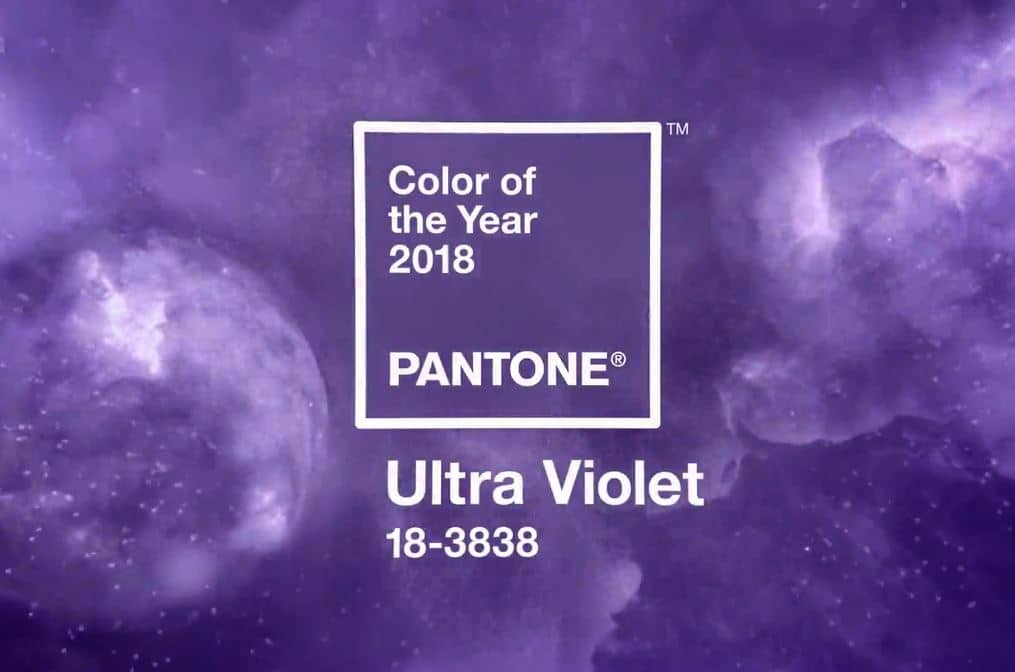
The Pantone Institute have announced that PANTONE 18-3838 Ultra Violet is their Colour of the Year for 2018.
A provocative yet thoughtful shade of purple that speaks of individuality, visionary thinking towards the future and the unknown, this blue-based purple will take our awareness and potential to a higher level.
Shades of purple tend to connote words like regal, enigmatic, eccentricity and artistic, all terms we associate with breaking away from the norm. Musical icons like Jimi Hendrix, David Bowie and Prince used Ultraviolet in expressing their individuality during their careers.
PANTONE 18-3838 Ultra Violet is an unforgettable shade that will help those in design, print, fashion and interior furnishings to push their creative boundaries into unknown territory, creating unique designs during 2018.

What is the PANTONE Colour of the Year?
“A symbolic colour selection; a colour snapshot of what we see taking place in our global culture that serves as an expression of a mood and an attitude.”
The Pantone Institute have been selecting a ‘Colour of the Year’ since 2000, bringing some unique colours to the forefront.
- In 2017 it was PANTONE 15-0343 Greenery – symbolic of new beginnings, refreshing and revitalising. Symbolising the connection we seek with nature, it encourages us to breathe deep, oxygenate and reinvigorate.
- In 2014 it was PANTONE 18-3224 Radiant Orchid – bringing magical warmth that intrigues the eye and sparks the imagination.
- In 2012 they brought us PANTONE 17-1463 Tangerine Tango – dramatic and seductive it combines the adrenaline rush of red with the warmth of yellow to emanate heat and energy.
- In 2010 PANTONE 15-5519 Turquoise was in the limelight – with the serene qualities of blue and the invigorating aspects of green, it inspires thoughts of tropical waters and an escape from the pressures of everyday life.
“The Pantone Colour of the Year has come to mean so much more than ‘what’s trending’ in the world of design; it’s truly a reflection of what’s needed in our world today.” – Laurie Pressman, Vice President of the Pantone Colour Institute.
We are all aware of how colour and its ability to convey messages and meanings is now an important element when it comes to design and branding. The Pantone Colour of the Year is a moment in time that helps to give strategic direction to designers around the world.
Where does the word Ultraviolet come from?
The word has Latin roots: ‘ultra’ means beyond, and ‘violet’ comes from the word ‘viola, for the violet flower. Violet is also the colour of the highest frequencies of visible light, and ‘ultraviolet’ implies a higher frequency than visible light. Ultraviolet refers to things that the naked eye cannot see.
Be prepared to see the colour Ultraviolet everywhere this year. You may even be seeing it already; from shoes to sofas, or lipstick to lamp shades. You may also see it being integrated in logos, websites and other branding and promotional products… we’re even seeing it here at The Printed Bag Shop in design ideas for custom printed bags!

Using Ultraviolet or other colours in your design without compromising your branding
Ultraviolet is an amazing colour – if you can use it in your design and branding then that’s great, but it won’t be for every business. Colour is such an important part of your branding, and it’s the first thing consumers will notice about your logo. There’s plenty of information out there that show what a colour suggests and the emotion it can evoke.
Purple is associated with royalty, sophistication, mystery and spirituality. If your business is high end retail; fashion, jewellery or beauty products, or you are in the business of mindfulness and spirituality, PANTONE 18-3838 Ultra Violet could work well for you this year.
Work with a good designer when developing your branding; they understand the importance of colour in a design. Choosing colours for your brand shouldn’t be about your favourite colour, but rather what you want your logo to say about your company.
Getting the right colour scheme is about asking the right questions
- What does your brand stand for?
- What message do you want to convey?
- Who is the consumer?
From the answers a designer will define the core colours to use, where they will be used and in what proportions. It is by understanding the proportions of colour used that a good designer will produce an amazing logo with a strong colour theme that enhances your brand rather than compromising it.
On your website and other branding you should use your dominant colour sparingly; it needs to jump out at people highlighting what you want your audience to focus on. Use your complimentary accent colours to highlight secondary information that you still want to stand out, just not as boldly as the main colour.
If you are targeting a global market it is important to understand what colours mean to people in other countries with different cultures. In China, for example, red can symbolise good luck, while white often represents death. In Muslim countries green represents the prophet Muhammad. Some Islamic banks may use this colour in their logos to convey trust.
Choosing the right colour for your branding is so important… look at some of the most iconic brands that we all recognise instantly from their logo, like McDonalds, Coca Cola and Cadbury.
Cadbury and the colour purple have been happy together since 1914. Throughout the years their packaging has changed but always that purple wrapper is instantly recognisable. The purple used, PANTONE 2685C, is officially known as Cadbury Purple.
If you have to call out a brand associated with the colour red, Coca Cola is usually the instant response. Red is linked so inextricably with Coca Cola that legend has it Santa Claus was rebranded to match!
If you’re planning on using the exciting new Pantone Colour of the Year for 2018, Ultraviolet, in your branding and design this year, don’t forget the experienced design team at The Printed Bag Shop can have your matching custom printed bags looking amazing in no time!
(Images from the Pantone website here)


